National Records of Scotland has recorded life expectancy for people in Scotland since 1980-1982, life expectancy is always calculated for three years to reduce the effect of unusual years. For the three decades that followed, life expectancy has increased, meaning that people in Scotland live longer than at any other time in history. However, over the last few years life expectancy has stopped increasing and in 2015-2017, it even went down slightly.

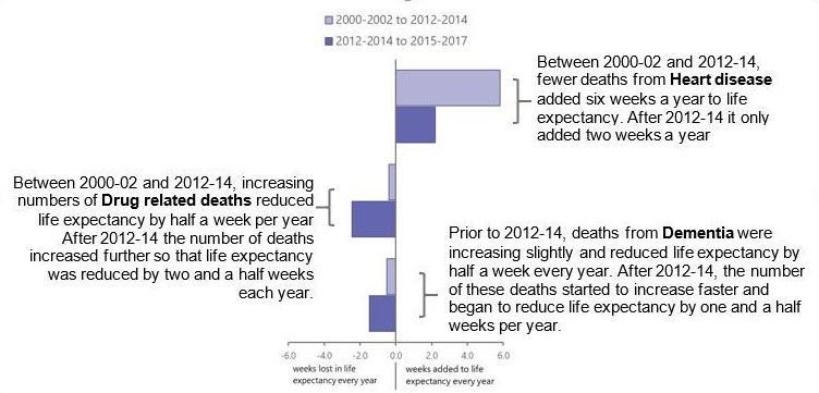
*This chart shows only males, but the pattern is very similar for females.
Julie Ramsay and Maria Kaye-Bardgett, statisticians in Vital Events at NRS explain on-going work with NHS Health Scotland to investigate what factors may have contributed to this stall.
Life expectancy is calculated by looking at the ages people died at. To identify this we look at death certificates and see whether different causes of death affect life expectancy in different ways. For example when fewer people die from a particular cause than in previous years, this adds more weeks of life to life expectancy and people can expect to live longer. When a cause of death becomes more common, it takes weeks away from life expectancy, resulting in shorter lives.
Following this, we found that deaths from some causes have increased (for example, dementia) and some have decreased (for example, lung cancer) since the early 2000s.
However, after the 2012-2014 turning point, almost all causes of death are adding fewer years to life expectancy than they were before 2012-2014.
The largest change was in deaths from heart disease. Before the turning point, deaths from heart disease were decreasing at a really fast rate, so that six weeks for males and four and a half weeks for females were being added to life expectancy every year, just due to improvements to heart disease. After 2012-2014 though, the rate of improvement fell so that only 2 weeks a year were being added to both male and female life expectancy each year.
The second largest change to life expectancy came from deaths caused by drugs. Before the turning point, drug-related deaths only had a small effect on life expectancy. The increase in drug-related deaths in recent years has meant that from 2012-2014 onwards, an additional two weeks every year has been lost from life expectancy for both males and females.
The diagram below shows some of the causes of death that changed the most after 2012-2014 for males, this pattern is similar for females.
We also looked at the age of people were when they died and combined this with the cause of death data. The grid shows the number of weeks lost from or added to life expectancy each year- where squares are blue, life expectancy is improving. Where the squares are red, life expectancy is decreasing. 
Before 2012-2014, there are more blue than red squares, indicating that life expectancy is increasing. After this point, the red and blue squares are much more even, with slightly more red than blue, showing that life expectancy has stalled and is starting to fall.
There are big differences in deaths from circulatory diseases (heart disease and stroke) at age 55-74 and age 75-89 (change from dark blue to light blue). There is also a large change between drug deaths at age 35-54 and for dementia at age 75-89 (both change from pale red to darker red).
Knowing which causes and what ages of death lead to shorter life expectancy helps us to better understand how this trend might be reversed. This information helps the Scottish Government in developing policy to help people in Scotland live longer and healthier lives.
You can find out more about this work in our paper written jointly with colleagues in the NHS.
